Watch design tends to revolve around addition. A watchmaker will add a complication, for example. Or maybe two. Or nine. And perhaps a set of blued hands, and polished center links, and of course lume, and a rotating bezel, and and and. The watch that haunts me right now is one that’s all about subtraction. In its austerity, it asks some profound questions: For starters, why am I wearing a watch? And more existentially, what even is a watch?
They say time is a flat circle. In this case, time is a squashed square.
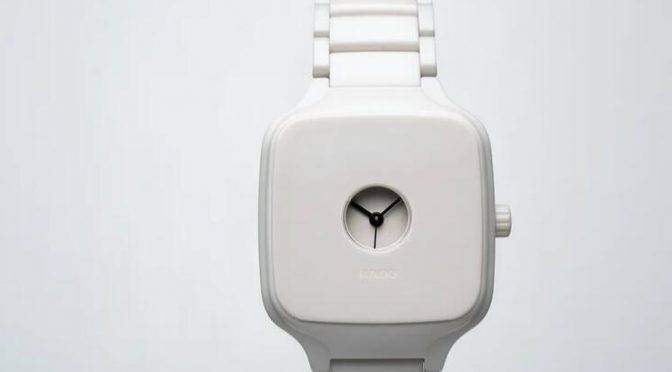
I’m talking now about the Rado True Square Formafantasma, a collaboration between the ceramic-watch pioneer and the Italian-Dutch design duo. It’s brutally simple. It’s quietly provocative. And it’s my favorite release of 2021.
I’m not saying it’s the “best” watch of the year, whatever that means. The black 34mm AP Royal Oak is sexier. The rose-gold Patek Calatrava is more elegant. By any conventional standard, they’re both better than this weirdo Rado. But I am frankly so tired of conventional standards. When I look at a watch, what I want is to see something I’ve never seen before. Or, even better, to feel something I’ve never felt.
I stood at attention when Ming and Massena made their honeycomb watch. That was awesome. I even got a little heart palpitation when the old-timers at Arnold & Son unveiled their lovely and unusual moonphase marble, even though it is completely and totally uncool. Oh well. I am a grown man and I do not care – like, at all – what is cool. I used to care, when I was a teenager. Cool was very important to me then. But in retrospect, achieving adulthood (somewhere in my 20s or even 30s; later than it should’ve been, that’s for sure) was largely about accepting that my tastes are what they are. When I finally embraced my own idiosyncratic point of view on the world, I became so much happier. Anyway, these days I think about watches for a living. And I’m here to tell you that the Rado True Square Formafantasma is the one I can’t get out of my head.
Formafantasma means “ghost shape,” which is a pretty good description of this watch. The name also hints at the design studio’s broader interest in materials. Co-founders Simone Farresin and Andrea Trimarchi toggle between the corporate world (they’ve taken commissions from Lexus and Hermès) and the art world (their stuff appears in places like the Venice Biennale, the Serpentine Gallery, and the Rijksmuseum), and yet they somehow stand apart from both.
Farresin grew up in the Italian countryside, in the 1980s, wearing Swatches by architect Alessandro Mendini and Memphis Group artist Natalie du Pasquier. So all along he’s seen the connection between horology and design. In 2014, he and Trimarchi made a clock from cooled Sicilian volcano lava. When it came time to work with Rado True Square, they wanted to create something that transcended function. They weren’t interested in the practical. They cared about the emotional and intellectual – to the point that, at first, they considered closing the dial like an antique pocket watch. You’d see no hands, no hour markers. Nothing but a blank face. The watch would work, but the only way you’d know would be the ticking.
In the end, they (wisely) realized that would be an unnecessary provocation. There’s a fine line between making an aesthetic point and making something nobody wants to wear. So they cut out a tiny porthole window, protected by a sapphire crystal, through which – if you squint – you can see a pair of hands.
Dispensing with the pesky matter of timekeeping, they leave you to contemplate the rest of the object. And there’s plenty to ponder.
The watch might best be understood as a materials study. It’s all about the ceramic. Formafantasma recognized that a lot of modern ceramic looks, at least from a distance, like metal. What’s the point of that? They didn’t want shiny; they wanted organic. So they stripped back the material until it looked and felt like bone.
The result is equal parts soothing and eerie. On the wrist it feels intimate. Almost too intimate. The horological equivalent of ASMR.
With a 38mm case that’s 10.4mm thick, it passes as unisex – which is important, because this piece is not meant to be a masculine power watch. It actually seems to absorb power, rather than radiate it. Even the price (a modest $2,550) is an inclusive gesture, though of course financial inclusivity is relative in the watch world. Plenty of consumers will no doubt see this thing and say “Two and a half grand? It barely tells the time!”
Those people will be missing the point. You wear this watch for the same reason you read a book instead of a Kindle. You want the tactility. The sensory experience. Yes, you can find a device that does the same job much more efficiently. But some of us are still willing to sacrifice efficiency for a state of genuine wonder.